Stop Making Gantt Charts That Put People to Sleep: The Visual Design Guide
Your project timeline shouldn't look like a spreadsheet threw up. Here's how to create Gantt charts that actually get people excited about your project.
We Need to Talk About Your Gantt Charts
Let's be honest. You've been there. You spend hours perfecting your project timeline—every task mapped, every dependency tracked, every milestone precisely placed. You walk into that meeting feeling confident.
Then you pull up your Gantt chart and watch as eyes glaze over faster than donuts at a police convention.
The problem isn't your project management skills. The problem is that your Gantt chart looks like it was designed by a robot for other robots.
Here's the thing: humans are visual creatures. We make split-second judgments based on what we see. If your chart looks boring, people assume your project is boring. If it looks confusing, they assume your project is confusing.
Time to fix that.
The Secret Weapon: Strategic Color Psychology
Color isn't just decoration—it's communication. The right colors can turn your timeline from a boring data dump into a compelling story that people actually want to follow.
Red = "Pay Attention, This Matters"
Use red (and its cousins orange and dark blue) for tasks that could make or break your project. These are your critical path items—the ones that, if delayed, will push back your entire timeline.
In our Gantt Chart Generator, just add the color before your task name:
{red}Development Sprint 1: 2025-09-26 to 2025-10-10{orange}Client Design Review: 2025-09-25
Blue = "Steady Progress"
Blue is your workhorse color. Professional, calming, trustworthy. Use it for important work that needs to get done but won't derail the project if it takes an extra day or two.
{blue}Research & Discovery: 2025-08-26 to 2025-09-09{green}Documentation Phase: 2025-10-15 to 2025-10-30
Yellow = "Victory Moments"
Milestones deserve special treatment. Make them shine with yellow, purple, or bright green. These are your celebration points—the moments when you can actually see progress happening.
{yellow}Project Kick-off: 2025-08-25{purple}Final Deployment: 2025-11-04
The Art of Naming Tasks (Without Sounding Like a Robot)
Here's where most people mess up: they write task names for themselves, not for their audience.
Write Like You're Texting, Not Writing a Legal Document
Instead of this: "Comprehensive user interface design and user experience optimization implementation phase"
Do this: "Design Phase"
Your Gantt chart isn't a contract. It's a communication tool. Keep it simple, keep it scannable.
The "Action + Object" Formula That Actually Works:
Design Interface: 2025-09-10 to 2025-09-24Test Functionality: 2025-10-15 to 2025-10-25Launch Product: 2025-11-04
Be Consistent (Your Brain Will Thank You)
Pick a naming pattern and stick with it. Consistency reduces cognitive load—which is a fancy way of saying "people won't have to think as hard to understand your chart."
Milestone Magic: Making Progress Visible
Here's something cool about our tool: any single date automatically becomes a diamond-shaped milestone. Use this superpower wisely.
What Deserves the Diamond Treatment?
Project Gates (The Big Decisions):
Project Approval: 2025-08-25Design Sign-off: 2025-09-25Go-Live Decision: 2025-11-01
Major Deliverables (The Stuff People Care About):
Prototype Complete: 2025-09-15Beta Release: 2025-10-15Final Launch: 2025-11-04
Style Choices That Actually Make a Difference
The devil is in the details, and the details are in your styling choices.
Background Psychology
White Background: "We're serious professionals who get things done."
Transparent Background: "We play well with others and fit into any presentation."
Light Gray: "We care about your eyeballs during those long planning sessions."
The Title Game
Your chart title sets expectations. Make it count:
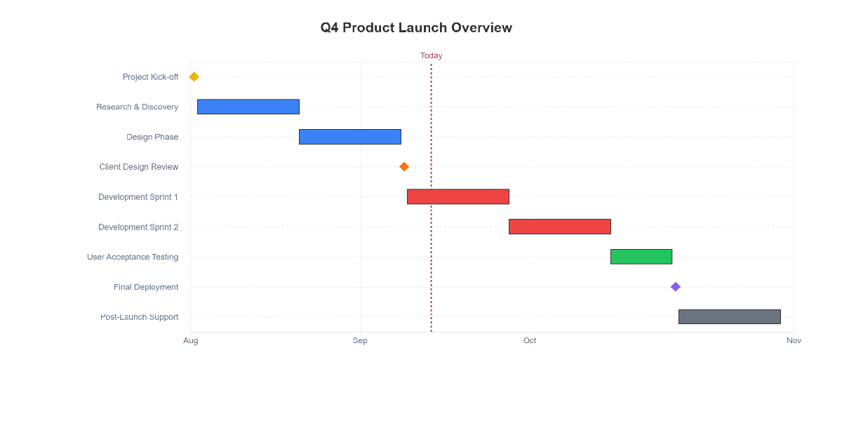
- For Executives: "Q4 Product Launch Overview" (high-level, outcome-focused)
- For Your Team: "Sprint Planning Timeline - October" (tactical, time-focused)
- For Clients: "Project Delivery Schedule" (professional, commitment-focused)
The Step-by-Step "Make It Not Suck" Process
Step 1: Choose Your Color Story
Before you touch any software, decide: Are you coding by priority? By team? By project phase? Write it down. Stick to it. Your future self will thank you.
Step 2: Format Like You Mean It
Here's the magic syntax that makes everything work:
{color}Task Name: Start Date to End Date{color}Milestone Name: Single Date
Real-world example that doesn't suck:
{yellow}Project Kick-off: 2025-08-25
{blue}Research & Discovery: 2025-08-26 to 2025-09-09
{blue}Design Phase: 2025-09-10 to 2025-09-24
{orange}Client Design Review: 2025-09-25
{red}Development Sprint 1: 2025-09-26 to 2025-10-10
{red}Development Sprint 2: 2025-10-11 to 2025-10-25
{green}User Acceptance Testing: 2025-10-26 to 2025-11-03
{purple}Final Deployment: 2025-11-04
{gray}Post-Launch Support: 2025-11-05 to 2025-11-19
Step 3: Add the "Where Are We?" Line
Turn on that today marker. That red line becomes your "you are here" indicator, instantly showing stakeholders what's done, what's happening now, and what's coming next.
Common Ways People Ruin Perfectly Good Gantt Charts
The Rainbow Explosion
The Crime: Using every color in the rainbow because "it looks more interesting."
Why It Fails: Your chart looks like a unicorn sneezed on it. Stick to 4-5 colors maximum.
The Fix: Create a color system and stick to it religiously.
Instead of this rainbow mess:
{red}Task 1: 2025-08-26 to 2025-09-09
{blue}Task 2: 2025-09-10 to 2025-09-24
{green}Task 3: 2025-09-25 to 2025-10-10
{yellow}Task 4: 2025-10-11 to 2025-10-25
{purple}Task 5: 2025-10-26 to 2025-11-03
{orange}Task 6: 2025-11-04 to 2025-11-19
Do this organized approach:
{blue}Research Phase: 2025-08-26 to 2025-09-09
{blue}Design Phase: 2025-09-10 to 2025-09-24
{orange}Review Checkpoint: 2025-09-25
{red}Development Phase: 2025-10-11 to 2025-10-25
{red}Testing Phase: 2025-10-26 to 2025-11-03
{green}Launch: 2025-11-04
The Novel-Length Task Name
The Crime: "Complete comprehensive user interface design and user experience optimization implementation phase"
Why It Fails: Nobody has time to read a sentence that long. They'll skip it.
The Fix: "Design Phase." Done.
The Milestone Participation Trophy
The Crime: Making every tiny task a milestone because "progress is progress."
Why It Fails: When everything is special, nothing is special.
The Fix: Reserve milestones for genuine achievements that stakeholders care about.
Real Projects, Real Results
Here's what these principles look like in the wild:
Software Development Project
{yellow}Sprint Planning Complete: 2025-08-25
{blue}Backend Development: 2025-08-26 to 2025-09-15
{blue}Frontend Development: 2025-09-16 to 2025-10-05
{orange}Integration Testing: 2025-10-06 to 2025-10-20
{green}Production Deployment: 2025-10-21
{gray}Post-Launch Monitoring: 2025-10-22 to 2025-11-05
Marketing Campaign Launch
{purple}Campaign Approved: 2025-08-25
{blue}Content Creation: 2025-08-26 to 2025-09-10
{blue}Asset Production: 2025-09-11 to 2025-09-25
{orange}Review & Approval: 2025-09-26 to 2025-10-01
{red}Campaign Launch: 2025-10-02
{green}Performance Analysis: 2025-10-03 to 2025-10-17
The Final Check: Does Your Chart Pass the "So What?" Test?
Before you share your masterpiece, ask yourself:
- Can a stranger understand the project flow in 10 seconds?
- Do the colors guide attention to what matters most?
- Would you actually use this chart in a status meeting?
- Does it look professional enough for your CEO?
- Does it look interesting enough for your team?
If you answered "no" to any of these, go back and fix it. Your reputation depends on it.
Ready to Stop Boring People?
Here's the bottom line: great Gantt charts aren't about showing off how much detail you can cram into a timeline. They're about telling a story that people actually want to follow.
The fundamentals are simple:
- Use color strategically, not randomly
- Write task names for humans, not robots
- Make milestones meaningful, not mundane
- Style for your audience, not your ego
Ready to transform your boring project timelines into compelling visual stories? Try our Gantt Chart Generator and watch how the right design choices can turn your next project presentation from "meh" to "wow."
Because life's too short for ugly Gantt charts.
Keep the Momentum Going
Related Tools That Actually Help:
- Priority Matrix - Figure out what deserves the red color treatment
- Roadmap Timeline - For when you need the 30,000-foot view