Priority Matrix Mastery: Choosing and Designing the Right Framework for Every Decision
priority-matrix-choosing-designing-right-framework
The Priority Matrix Problem No One Talks About
Here's the thing about priority matrices: everyone knows they should use them, but most teams end up with a confused mess of sticky notes, conflicting spreadsheets, or—worst case—nothing at all because they couldn't decide which framework to use. You've been there. The team meeting where someone suggests "let's prioritize using a matrix," and then twenty minutes of debate ensues about whether to use Eisenhower, Impact vs Effort, or that MoSCoW thing Sarah read about.
The problem isn't that priority matrices don't work. They absolutely do. The problem is that most teams treat framework selection like picking a religion—once you choose, you're locked in forever. In reality, different projects need different lenses. Your daily task management needs a different approach than your strategic portfolio planning. Your product backlog requires different criteria than your innovation pipeline.
Let's fix that. This guide will show you how to choose the right priority matrix for your specific situation, design it for maximum visual impact, and actually use it to drive decisions rather than just decorate your project documentation.
The Visual Design Principles That Make Matrices Actually Work
Before we dive into which matrix to use when, let's address why so many priority matrices fail: they're visually incomprehensible. A priority matrix is fundamentally a communication tool. If your stakeholders can't understand it at a glance, you've created a bottleneck, not a solution.
Principle 1: Color Is Your Strategic Weapon
The human brain processes visual information 60,000 times faster than text. Your matrix should leverage this at two levels: quadrant-level colors for overall structure, and task-level colors for strategic emphasis.
Each quadrant needs a distinct, meaningful color that communicates priority level instantly. Red for "Do First" isn't just aesthetically pleasing—it triggers the same neural pathways as a stop sign, demanding immediate attention. But here's where most teams go wrong: they apply color randomly or use their "brand colors" without thinking about meaning. A pastel purple "Critical Tasks" quadrant sends the wrong signal.
But quadrant colors are just the foundation. The real power comes from adding strategic color tags to individual tasks within those quadrants. When you tag a specific task with red, blue, or green, you create a second layer of visual meaning. This lets you highlight mission-critical items within any quadrant, indicate task categories (technical vs. business), show ownership, or flag dependencies—all without cluttering your matrix with additional text.
For example, in your "Schedule" quadrant, you might use blue tags for strategic planning tasks and green tags for relationship-building activities. This visual coding makes patterns immediately visible: if all your blue-tagged strategic work is concentrated in one time period, you can rebalance before it becomes a bottleneck.
Principle 2: White Space Is a Feature, Not a Bug
A cluttered matrix is a useless matrix. If you have forty items crammed into one quadrant and three in another, your matrix isn't clarifying priorities—it's just reorganizing chaos. Visual balance matters. Each quadrant should be clean enough that individual items are scannable.
This is where the hard work happens: if your "High Impact, Low Effort" quadrant is overflowing, you haven't actually prioritized. You've just labeled everything as important. Time to get ruthless with your scoring criteria.
Principle 3: Labels Must Do Heavy Lifting
Generic labels like "High/Low" on your axes tell you nothing. Compare "High Importance" versus "Contributes to Q4 Revenue Target." The second version grounds your matrix in a specific, measurable outcome. Anyone looking at it understands exactly what "high" means in this context.
Choosing Your Framework: A Decision Tree That Actually Works
Let's be honest: you don't need to master all priority matrix frameworks. You need to know which ones to use for the most common situations, and how to recognize when you need something different.
For Daily Task Management: The Eisenhower Matrix Wins Every Time
If you're drowning in a sea of Slack messages, meeting requests, and an ever-growing to-do list, start here. The Eisenhower Matrix's genius is its brutal simplicity: Urgent vs Important creates four clear action categories.
Quadrant 1 (Urgent & Important) gets done today. Quadrant 2 (Not Urgent & Important) gets scheduled. Quadrant 3 (Urgent & Not Important) gets delegated. Quadrant 4 (Not Urgent & Not Important) gets eliminated. No endless priority scales. No "medium-high" confusion. Just clear directives.
The visual design here is critical: use red for Quadrant 1, blue for Quadrant 2, yellow for Quadrant 3, and gray for Quadrant 4. This creates an instant heat map of where your time should flow. And here's where task-level color tags become powerful: within your red "Do First" quadrant, you might use additional color tags to distinguish between crisis management (keeping things red) versus critical deadline work (tagging with orange), helping your team understand not just what needs immediate attention, but why.
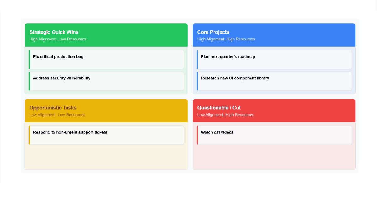
For Product Backlogs: Impact vs Effort Maximizes Your ROI
When you're deciding which features to build next, the Eisenhower Matrix falls apart. "Urgent" becomes meaningless when everything is "urgent" according to at least one stakeholder. You need a framework that explicitly balances value against cost.
Impact vs Effort (also called the Action Priority Matrix) plots potential value on one axis and resource requirements on the other. This creates four strategic categories: Quick Wins (high impact, low effort), Major Projects (high impact, high effort), Fill-Ins (low impact, low effort), and Money Pits (low impact, high effort).
The visual strategy here: make the Quick Wins quadrant the most visually prominent with a vibrant green. This is where your team's eyes should go first. The Money Pits quadrant should be red—a visual warning sign that screams "Don't waste resources here."
For Release Planning: MoSCoW Manages Expectations Like Nothing Else
When you need to communicate what's definitely shipping versus what's aspirational, MoSCoW (Must-have, Should-have, Could-have, Won't-have) is your framework. Unlike the 2x2 matrices, MoSCoW is categorical, which makes it perfect for stakeholder management.
The visual approach: create four vertical columns, each with its own color. Must-haves in red (non-negotiable), Should-haves in orange (important but flexible), Could-haves in yellow (nice to have), and Won't-haves in gray (explicitly out of scope). This visual hierarchy makes promises clear and manages scope creep before it starts.
The Implementation Gap: Where Good Plans Die
You know what's worse than having no priority matrix? Having a beautiful, well-thought-out matrix that lives in a slide deck nobody looks at. The gap between creating a matrix and actually using it to drive daily decisions is where most prioritization efforts collapse.
Make It Accessible, Not Archived
Your priority matrix needs to be a living document that your team references multiple times per day, not a static artifact created once per quarter. This means it needs to be easily accessible, quickly updatable, and sharable without friction.
Here's where tool choice matters. A priority matrix drawn on a whiteboard is great for the workshop where you create it, but useless the moment someone needs to reference it from home or share it with a remote stakeholder. A matrix buried in a 47-slide deck is similarly doomed. You need a format that's both visual and digital—something you can pull up in seconds during a standup or drop into a Slack thread when priorities are being debated.
Tools like ProjectRollouts Priority Matrix solve this by letting you build your matrix with a simple text input, then instantly visualize it with customizable quadrant colors and individual task color tags. Whether you're running an Eisenhower Matrix for weekly planning or an Impact vs Effort analysis for your product backlog, you can switch frameworks and export clean, professional visuals that live wherever your team works—embedded in your project management tool, pinned in your team channel, or linked in your project brief.
Build Update Rituals Into Your Workflow
A priority matrix from January is fiction by April. Market conditions shift. Technical blockers emerge. That "Quick Win" becomes a major project when you discover the technical debt involved. Your matrix must evolve with reality.
Schedule specific review points: at sprint planning meetings, at the start of each month, or whenever a major variable changes (new competitor launch, unexpected budget cut, key team member departure). During these reviews, don't just add new items—actively question whether existing placements still make sense.
Advanced Strategies: When Standard Frameworks Aren't Enough
Once you've mastered the core three frameworks, there are situations where you'll need to reach for more specialized tools.
For Strategic Portfolio Decisions: Risk vs Reward
When evaluating major investments or deciding which projects to fund, you need a framework that explicitly accounts for uncertainty. The Risk vs Reward Matrix plots potential upside against probability of failure, creating four categories: Pearls (high reward, low risk), Oysters (high reward, high risk), Bread and Butter (low reward, low risk), and White Elephants (low reward, high risk).
The visual design principle here: this matrix should feel more conservative than your day-to-day task matrices. Use muted tones and ensure the White Elephants quadrant is clearly marked as territory to avoid. This is where you're making decisions that affect budgets and careers—the visual should communicate that gravity.
For Innovation Pipelines: Feasibility vs Desirability
Before you prioritize how to build something, you need to decide if you should build it at all. The Feasibility vs Desirability Matrix plots user demand against technical capability. Ideas that are highly desired but hard to build become R&D investments. Ideas that are easy to build but nobody wants get killed before they waste resources.
For Organizational Alignment: The Strategic Alignment Matrix
Large organizations face a unique problem: teams can be highly productive while collectively accomplishing nothing strategic. The Strategic Alignment Matrix plots projects against their contribution to corporate goals and the organization's capability to execute them. This reveals the dangerous "spinning wheels" projects—things the company is good at doing but which don't move any strategic needles.
For Project Kickoffs: SWOT Analysis Generates Strategy
Most priority matrices help you sort existing tasks. SWOT Analysis does something different: it helps you generate the right strategic actions in the first place. By systematically analyzing Strengths, Weaknesses, Opportunities, and Threats, you create the strategic context needed before prioritization begins.
The SWOT framework divides factors into internal (Strengths and Weaknesses you control) and external (Opportunities and Threats you must respond to). But the real power comes from the TOWS Matrix evolution, which pairs these factors to generate specific strategic actions:
Strengths-Opportunities (SO): "How can we use our strengths to maximize opportunities?" These become your aggressive, high-confidence initiatives. Example: Leverage your established brand reputation to launch in an emerging market.
Weaknesses-Opportunities (WO): "How can we leverage opportunities to shore up weaknesses?" These become your capability-building projects. Example: Partner with a technology leader to overcome your outdated infrastructure.
Strengths-Threats (ST): "How can we use strengths to minimize threats?" These are defensive plays that protect what you've built. Example: Use your loyal customer base to defend against a new competitor.
Weaknesses-Threats (WT): "How do we minimize weaknesses and avoid threats?" These are your contingency and risk mitigation strategies. Example: Exit a market where you lack expertise and face intense competition.
The strategic actions generated from a SWOT/TOWS analysis become high-quality inputs for your other priority matrices. An SO strategy is inherently "High Impact" for an Impact vs Effort matrix. A WT strategy often belongs in your Risk vs Reward analysis. This is why SWOT works best at project kickoff or during strategic reviews—it provides the "why" behind your priorities before you start sorting tasks.
The Five-Question Quality Check
Before you finalize any priority matrix, run it through this quality checklist. If you can't answer "yes" to all five questions, your matrix needs work.
1. Can someone unfamiliar with the project understand the priorities in under 30 seconds? If your matrix requires a ten-minute explanation, it's too complex. Simplify your labels, reduce the number of items, or choose a clearer framework.
2. Are your axes defined with specific, measurable criteria? "High Impact" means nothing. "Reduces customer churn by >5%" means something. Get specific.
3. Is any quadrant overloaded while others sit empty? If everything is "high priority," nothing is. Redistribute ruthlessly or tighten your scoring criteria.
4. Could you defend each placement to a skeptical stakeholder with data? Gut feelings are fine for initial placement, but you need evidence for anything controversial. Be prepared to show your work.
5. Does the visual design reinforce your priorities or contradict them? Color, size, and layout should make the highest priorities visually dominant. If your "Quick Wins" are tiny pale text while your "Money Pits" are huge and bright, your design is sabotaging your decisions.
From Matrix to Action: Closing the Execution Loop
The ultimate test of any priority matrix isn't how good it looks in a presentation—it's whether your team's daily work actually reflects the priorities it defines. This requires deliberately connecting your matrix to your execution tools.
Items in your "Do First" or "Quick Wins" quadrant should automatically flow to the top of your sprint backlog. "Major Projects" should be decomposed into epics with clear owners and timelines. "Delegate" items should be assigned immediately, not left in limbo. And critically, items in your "Eliminate" or "Money Pit" quadrants should be actively removed from your roadmap and team capacity planning.
This is where having a flexible priority matrix tool becomes essential. Your team shouldn't need to learn different systems for each type of prioritization decision. The ability to switch between Eisenhower, Impact vs Effort, MoSCoW, Risk vs Reward, Feasibility vs Desirability, Strategic Alignment, and SWOT frameworks—all from a single interface—means your prioritization process becomes seamless rather than a monthly ordeal. Add your tasks once, choose your framework, customize your colors at both the quadrant and task level, and export professional visuals that integrate wherever your team works.
The goal is to make checking your priorities as natural as checking your email. When priorities are visible, accessible, and integrated into your workflow, they actually drive behavior. When they're locked in static documents, they're just expensive wall art.
Related ProjectRollouts Tools
Complete your project planning toolkit with these complementary tools:
• Gantt Chart Generator - Turn your prioritized tasks into a visual timeline with dependencies and milestones
• Roadmap Timeline - Communicate your strategic priorities across quarters with color-coded milestones
• Project Charter Generator - Document your project's prioritization criteria and decision-making framework