The Visual Roadmap Guide: How to Design Project Timelines That Get Stakeholder Approval
Transform chaotic project roadmaps into compelling visual stories that get stakeholder approval and maintain team alignment.
When Your Roadmap Looks Like a Toddler's Art Project
Picture this: You're presenting your carefully planned project roadmap to the executive team. You've spent weeks gathering requirements, mapping dependencies, and aligning stakeholders. But as you click to the roadmap slide, you watch their eyes glaze over at what looks like a colorful mess of overlapping boxes, tiny unreadable text, and a timeline that resembles a game of Tetris gone wrong.
Sound familiar? Here's the thing—most project managers are strategic masterminds who can orchestrate complex initiatives across multiple teams. But when it comes to creating roadmap visuals that actually communicate effectively? Let's just say there's room for improvement.
The difference between a roadmap that inspires confidence and one that creates confusion isn't your strategic thinking—it's your visual execution. Today, we're fixing that.
The Visual Hierarchy That Actually Works
Let's be honest: your roadmap isn't just a planning document. It's a persuasion tool. Every color choice, every font size, and every spacing decision either supports your narrative or undermines it. Here's how to make sure your visuals are working for you, not against you.
Start With the Story, Not the Timeline
Before you touch any roadmap tool, ask yourself: what's the one thing you want people to remember after seeing this? That becomes your visual anchor—the element that should be the largest, boldest, or most prominent on your roadmap.
The Three-Layer Visual System
Think of your roadmap like a well-designed poster. It needs three distinct visual layers:
Layer 1 - The Headlines: Your major phases or themes. These should be the largest text elements, using colors that create clear distinction. Think "Discovery Phase" or "Customer Experience Overhaul." This is where your roadmap title does heavy lifting—make it descriptive, not generic.
Layer 2 - The Storyline: Your key milestones and deliverables. Medium-sized text with consistent visual treatment. These are your "Beta Launch" and "Stakeholder Approval" markers that tell the progression story.
Layer 3 - The Details: Dependencies, notes, and granular timelines. Smallest text, used sparingly. If you're tempted to include task-level detail, resist—that belongs in your project plan, not your roadmap.
Color Psychology That Builds Confidence
Here's where most roadmaps go wrong: random rainbow syndrome. Just because you can use twelve different colors doesn't mean you should. Strategic color choices can actually influence how stakeholders perceive your project's feasibility and your team's competence.
The Strategic Palette
Different colors trigger different psychological responses. Use this to your advantage:
Blue Family (Trust & Stability): Perfect for foundational phases like research, infrastructure setup, or system architecture. When you need to signal "we're building on solid ground," blue milestones build confidence. Use deeper blues for critical path items that everything else depends on.
Green Family (Progress & Success): Ideal for completion markers, launches, and achievement milestones. Green signals "we've arrived" and "mission accomplished." Reserve this for your final deliverables and major wins to create positive momentum in your narrative.
Orange/Amber (Attention & Decision Points): Use for critical decision gates, approval requirements, or major transitions that need stakeholder focus. Orange says "important moment ahead" without triggering the alarm that red does. Perfect for go/no-go milestones or phase transitions.
Neutral/Gray (Supporting Work): Supporting activities, compliance requirements, or maintenance work. These are important but shouldn't compete with your main narrative. Let them recede into the background visually.
The Selective Color Strategy
Here's the secret: most of your milestones shouldn't have any special color treatment at all. A roadmap with 10 milestones should have color emphasis on only 3-4 of them. This creates visual punctuation that guides the eye to what matters most.
Think of it like highlighting a printed document. When you highlight every line, nothing stands out. But when you highlight just the three key sentences, those become impossible to miss.
Many roadmap tools support this through inline color tags. For example, you might structure milestones like this:
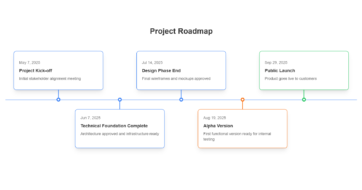
2025-06-08: Technical Foundation Complete - Architecture approved and infrastructure ready.
2025-07-08: Design Phase End - Final wireframes and mockups approved.
2025-08-08: Alpha Release Decision Gate - Go/no-go for internal testing.
2025-09-08: Public Launch - Product goes live to customers.
Notice how the color-emphasized milestones tell the story: solid foundation (blue), critical decision (orange), successful outcome (green). The uncolored milestones provide context but don't compete for attention.
Layout Choices That Match Your Message
The orientation of your roadmap—horizontal versus vertical—isn't just about fitting it on a slide. It's a strategic choice that affects how people perceive your project's timeline and complexity.
When to Go Horizontal
Horizontal layouts work best for projects spanning 6-18 months with clear sequential phases. The left-to-right flow mirrors how we read and naturally suggests forward momentum and narrative progression. It's the "journey" layout—you're taking stakeholders on a trip from start to finish.
Use horizontal layouts when:
- You want to emphasize time progression and sequential phases
- Your project has a clear beginning, middle, and end
- You're presenting on landscape-oriented screens or slides
- Your audience expects traditional timeline visualization
When to Go Vertical
Vertical layouts excel for long-term strategic roadmaps (18+ months) or projects with many parallel workstreams. They're easier to scroll through on mobile devices and work better when you're showing multiple concurrent initiatives that don't necessarily depend on each other.
Use vertical layouts when:
- You're mapping a long-term strategic vision (multi-year)
- You have numerous parallel activities happening simultaneously
- Your stakeholders will primarily view the roadmap on mobile or tablets
- You want to emphasize depth and breadth rather than linear progression
The Visual Identity That Builds Trust
Beyond individual milestone colors, your roadmap's overall visual identity communicates professionalism and thoughtfulness. These broader design choices might seem minor, but they significantly impact how stakeholders perceive your competence and preparation.
Primary Color: Setting the Tone
Your roadmap's primary color—the dominant hue used for headers, borders, or timeline bars—sets the emotional tone for the entire document. This is where brand alignment matters most.
If you're presenting externally or to brand-conscious stakeholders, use your company's primary brand color. This subtle alignment signals professionalism and attention to detail. For internal strategic planning, choose based on psychological impact: blue for trust-building in uncertain initiatives, green for growth-focused projects, or darker neutrals for serious, high-stakes work.
Background Strategy: Context Matters
White or very light gray backgrounds create the most professional, universally appropriate appearance. They work in any context—printed, projected, or viewed on screen—and ensure maximum readability.
Transparent backgrounds have one specific use case: when you're embedding the roadmap into slides or documents that already have their own design system. This lets your roadmap integrate seamlessly without creating jarring visual breaks. But for standalone documents or primary presentations, stick with solid backgrounds.
Text Color: Readability Wins
This is the easiest decision: use dark gray or black text. Period. The temptation to use colored text is strong, especially if you're committed to a brand palette, but colored text reduces readability and often looks amateurish. Save color for strategic emphasis on specific milestones, not for body text.
Common Mistakes That Kill Roadmap Credibility
Time to call out the roadmap sins that make stakeholders question your project management skills. If you're guilty of any of these, don't worry—we've all been there.
The Feature Factory Trap
Your roadmap isn't a wishlist. If it reads like "Build Dashboard → Add User Profiles → Integrate API → Launch Mobile App," you've created a feature factory, not a strategic roadmap. These output-focused lists tell stakeholders what you're building, but not why it matters.
Instead, frame everything around outcomes: "Improve Decision Making → Enhance User Engagement → Streamline Operations → Expand Market Reach." Then, if needed, you can include the specific deliverables as supporting details under each outcome-focused milestone.
The Precision Illusion
Stop pretending you know exactly when things will happen six months from now. Using specific dates like "March 15th" for future milestones makes you look naive, not prepared. Everyone in the room knows that projects shift, priorities change, and unexpected challenges emerge.
Use specific dates only for milestones in the next 6-8 weeks. For everything beyond that, use quarters (Q3 2025), months (September 2025), or relative timeframes (Month 6). This demonstrates strategic realism and actually builds more confidence than false precision.
The Everything-Is-Critical Problem
When everything is highlighted, urgent, or marked as high-priority, nothing is. This is where disciplined color usage becomes critical. If you've got blue, orange, green, red, and purple milestones all competing for attention, your roadmap becomes visual chaos.
Use visual emphasis sparingly. In a 10-milestone roadmap, use color tags on only 3-4 items. The rest should blend into a neutral baseline. This restraint makes your truly important milestones impossible to miss.
Milestone Placement That Tells a Story
Milestones aren't just project checkpoints—they're narrative beats in your project story. Place them strategically to create momentum and maintain stakeholder engagement throughout your timeline.
The Milestone Rhythm
Space your major milestones like chapters in a book. Too many, and people lose track of the plot. Too few, and the middle feels endless with no sense of progress. For most projects, aim for one significant milestone every 6-8 weeks.
This rhythm serves a psychological purpose: it creates regular moments for celebration, course correction, and stakeholder check-ins. Each milestone becomes a natural conversation point, preventing the dreaded "we haven't heard anything in three months" problem.
The Story Arc Structure
Structure your milestones to create a compelling narrative arc:
Act 1 - Setup (First 20-25%): Foundation milestones that build confidence. Research complete, architecture approved, team assembled. Use blue color emphasis here to signal solid groundwork.
Act 2 - Development (Middle 50%): The bulk of your execution milestones. These should mostly be neutral/uncolored to avoid overwhelming the viewer. They show steady progress without demanding constant attention.
Act 3 - Climax & Resolution (Final 25%): Decision gates and launch milestones. Use orange for critical approval points and green for successful completion markers. This is where your color strategy builds excitement.
Month 1: Market Research Complete - Foundation established
Month 2: Technical Architecture Approved - Planning complete
Month 3: Design Phase Complete - Wireframes finalized
Month 4: Beta Version Ready - Critical testing gate
Month 5: User Testing Complete - Feedback integrated
Month 5.5: Final Go/No-Go Decision - Stakeholder commitment
Month 6: Public Launch - Success milestone
Industry-Specific Visual Strategies
Different industries have different stakeholder expectations. Here's how to adapt your roadmap visual strategy based on your context.
Technology & Software Projects
Tech stakeholders expect to see clear development phases and integration points. Use terminology they recognize: MVP, Alpha, Beta, Production Release. Show parallel development streams clearly if you have frontend, backend, and infrastructure work happening simultaneously.
Always include a lane or section for technical debt, infrastructure work, or security updates—even if it's small. Its presence signals maturity and realistic planning. Tech leaders immediately distrust roadmaps that show only feature work.
Marketing Campaigns
Marketing roadmaps need to show channel coordination and campaign momentum building. If your launch involves email, social media, PR, and paid advertising, show how these channels build on each other over time.
Include "dark periods" or "content creation phases" explicitly. Marketing stakeholders know that campaigns require significant prep time before anything goes public. Showing this preparation time builds confidence that you've thought through execution.
Process Improvement & Change Management
Focus on before/after states and change management phases. Show current state assessment, design phases, pilot programs, and rollout waves. Use visual indicators for training requirements and stakeholder communication points—these are often where process improvements fail.
For these projects, consider adding a parallel "communication" or "change management" timeline that shows when and how you'll prepare people for changes. This demonstrates sophistication beyond just the technical implementation.
Data Input Strategies That Save Your Sanity
Now that you understand the visual principles, let's talk about efficiently getting your project information into roadmap format. The key is thinking in layers, not lists.
The Top-Down Data Flow
Step 1: Start with your 3-5 major themes or phases. Don't worry about dates or details yet—just get the big buckets defined. Examples: "Foundation," "Core Development," "Launch Preparation."
Step 2: For each theme, identify 2-4 key deliverables that signal phase completion. These become your milestone candidates. Keep them outcome-focused when possible.
Step 3: Now add your timeline estimates. Work backward from your end goal, not forward from today. This prevents timeline optimism bias. If you need to launch September 1st, work backward to figure out when everything else must happen.
Step 4: Add your strategic color emphasis. Mark only the 3-4 milestones that deserve special attention—your foundation marker, your critical decision points, and your success milestone.
Step 5: Add dependencies only for the big stuff—where one major phase truly can't start until another finishes. Resist the urge to map every dependency; that's for your detailed project plan.
The Simple Text Format Approach
One of the most efficient ways to build a roadmap is using a simple text format with inline formatting for emphasis. This lets you focus on content first, then worry about visual polish. A typical entry might look like:
{{blue}}2025-06-08: Technical Foundation Complete - Architecture approved and infrastructure ready
2025-07-15: Design Phase End - Final wireframes and mockups approved
{{orange}}2025-08-20: Alpha Version - First functional version ready for internal testing
{{green}}2025-09-30: Public Launch - Product goes live to customers
The {{blue}}, {{orange}}, and {{green}} markers let you assign strategic emphasis as you're drafting, without leaving your text editor. This "content-first, design-second" approach prevents you from spending two hours adjusting colors before you've even finalized your milestone list.
The 15-Minute Setup Rule
If you can't get the basic structure of your roadmap set up in 15 minutes, you're probably including too much detail. Remember: this is a strategic communication tool, not a project schedule. Your first draft should be fast and rough. You can refine the visual details after you've got stakeholder feedback on the strategic structure.
The Five-Question Roadmap Quality Test
Before you present your roadmap to anyone important, run it through this quick quality check. These five questions will catch the majority of roadmap problems:
1. The Glance Test: Can someone understand the basic story in under 10 seconds? Stand back from your screen. If the visual hierarchy doesn't immediately communicate "what this is about," you need more contrast or better milestone naming.
2. The Why Test: Is it clear why this project matters to the business? Your roadmap should answer "so what?" without requiring verbal explanation. If someone reads your milestones and thinks "okay, but why?" you're focused too much on outputs, not outcomes.
3. The Progress Test: Can stakeholders easily see how they'll know if you're on track? Your milestones should be verifiable and unambiguous. "Design phase complete" is measurable. "Good progress on design" is not.
4. The Confidence Test: Does the timeline look realistic, or optimistically aggressive? If your milestones are evenly spaced at exactly 4-week intervals, it looks artificial. Real projects have natural rhythm variations. Build in buffer time and show it.
5. The Action Test: Is it clear what happens next and who owns it? Even a strategic roadmap should make the immediate next steps obvious. Your first 2-3 milestones should be concrete enough that someone could start working toward them tomorrow.
Creating Roadmaps That Actually Get Approved
Here's the truth: the best roadmap isn't the most detailed one—it's the one that builds confidence in your ability to deliver. When stakeholders look at your roadmap, they're not just evaluating your project plan; they're evaluating you as a project leader.
A well-designed roadmap demonstrates strategic thinking, realistic planning, and professional execution. It shows you understand not just what needs to be done, but how to communicate complex initiatives in a way that builds trust and maintains alignment. The visual choices we've covered—strategic color usage, appropriate layout selection, disciplined milestone emphasis—all contribute to this impression of competence.
The best roadmaps share three characteristics: they're visually clean, strategically focused, and honestly realistic. They don't try to dazzle with complexity or hide uncertainty with false precision. They tell a clear story about how you'll get from here to there, with enough specificity to be credible and enough flexibility to be realistic.
When you nail these elements, something interesting happens in stakeholder meetings. Instead of questioning your timeline or poking holes in your plan, stakeholders start asking about how they can help. They see a professional, thoughtful approach and want to be part of making it successful. That's the true power of a well-designed roadmap—it transforms skeptics into supporters.
Ready to put these principles into practice? The Roadmap Timeline Generator gives you a clean, professional framework for implementing everything we've covered—strategic color coding with simple tags, flexible horizontal or vertical layouts, and customizable visual identity that matches your brand or presentation context. Build roadmaps that get approved, maintain stakeholder confidence, and keep your projects aligned with business goals.
Related ProjectRollouts Tools
Complete your project planning and communication toolkit with these complementary tools:
• Priority Matrix - Identify which roadmap initiatives truly deserve prime real estate in your timeline
• Gantt Chart Generator - Translate your high-level roadmap into detailed execution plans with task dependencies and resource allocation